Gym mobile app
Designing Solinca’s mobile app — unifying the fitness experience with clear structure and intuitive UI

Challenge
Solinca needed a complete redesign of its digital experience. The existing ecosystem lacked clarity, consistency, and a user-centric structure. Members struggled to book classes, navigate workout plans, or track their progress. They also need a scalable design system and a clear information architecture to support future features. The challenge was to create a new app from scratch that would: • simplify the core actions (booking, training, tracking), • improve motivation and retention, and • reflect Solinca’s brand across a coherent and intuitive interface.
Solution
Working alongside a cross-functional team, a User Research defined the product insights and direction. My contribution began in the Design phase, where I translated those insights into a clear and scalable product structure.
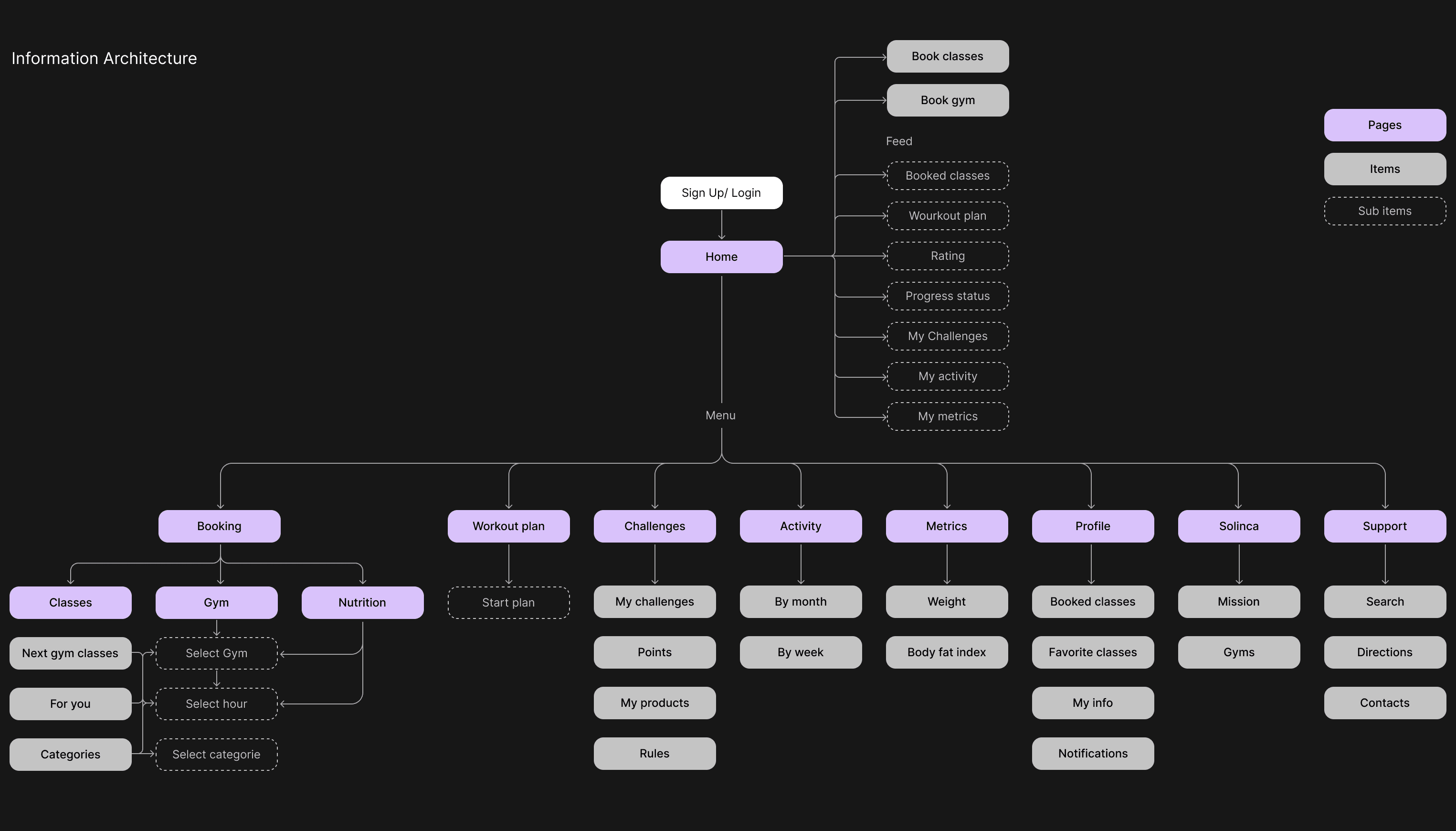
I defined the Information Architecture, mapped user flows, produced wireframes, and built a cohesive UI library with consistent interaction patterns. This work established an intuitive navigation system and a modular visual foundation for future growth.
Outcome
This project was delivered while I was working at a user-marketing agency, with Solinca as the client. After completing the Design phase, the final work was handed off to Solinca’s internal development team. Because the implementation and testing were handled on their side, I didn’t have the opportunity to participate in post-launch validation or iteration. However, the handoff provided a solid foundation for development and future improvements.
TL;DR
Solinca needed a redesigned mobile experience to unify booking, training, tracking, and member engagement. Using existing research, I led the full Design phase—creating the IA, user flows, wireframes, and UI library. This provided a clear, scalable foundation for their internal team to test and implement.
the process
1 - FOUNDATIONS ↓
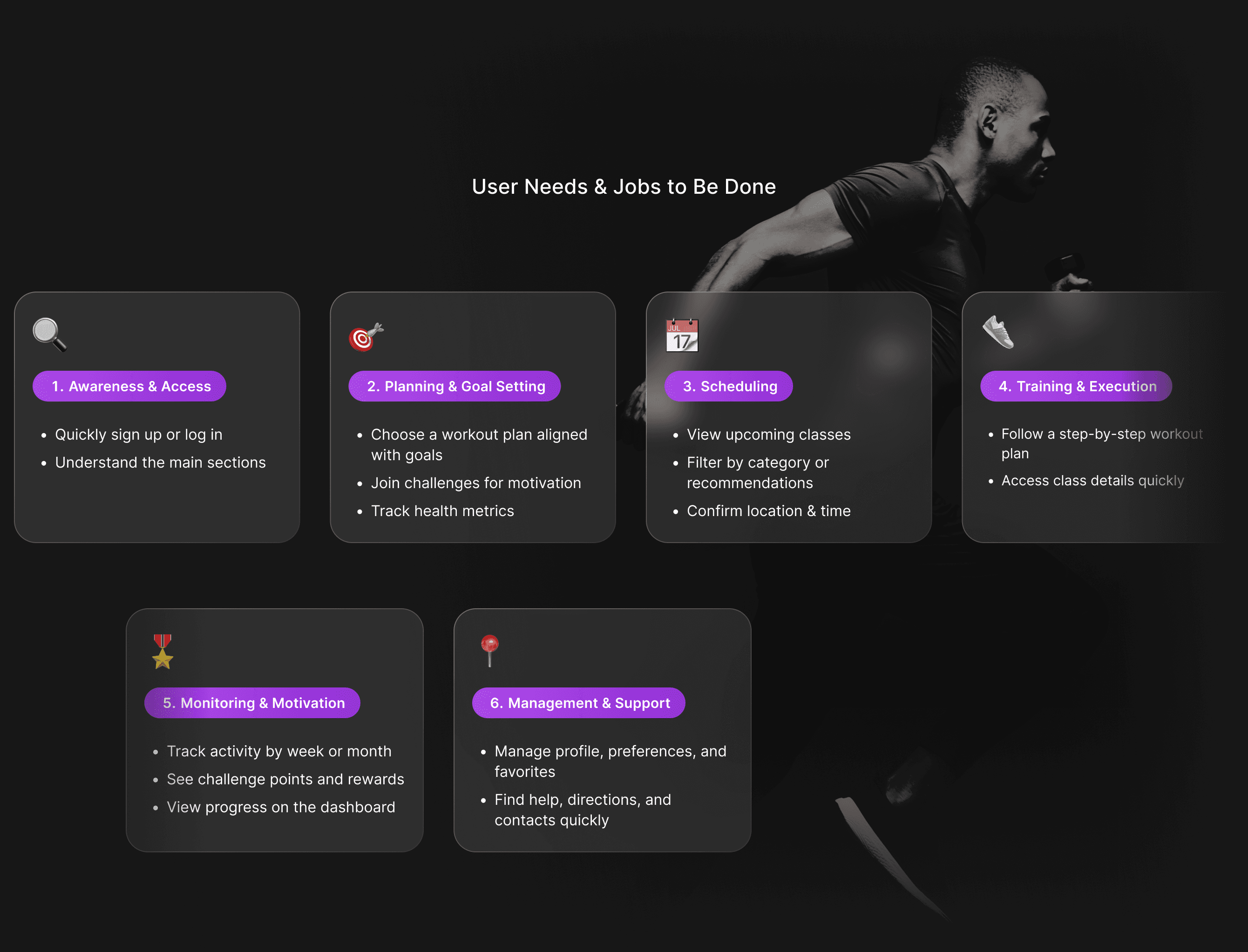
We identified user needs and mapped the essential Jobs to Be Done across the full fitness journey. These insights were then translated into a clear Information Architecture that structured the app’s core sections, flows, and content hierarchy.
2 - WIREFRAMES ↓
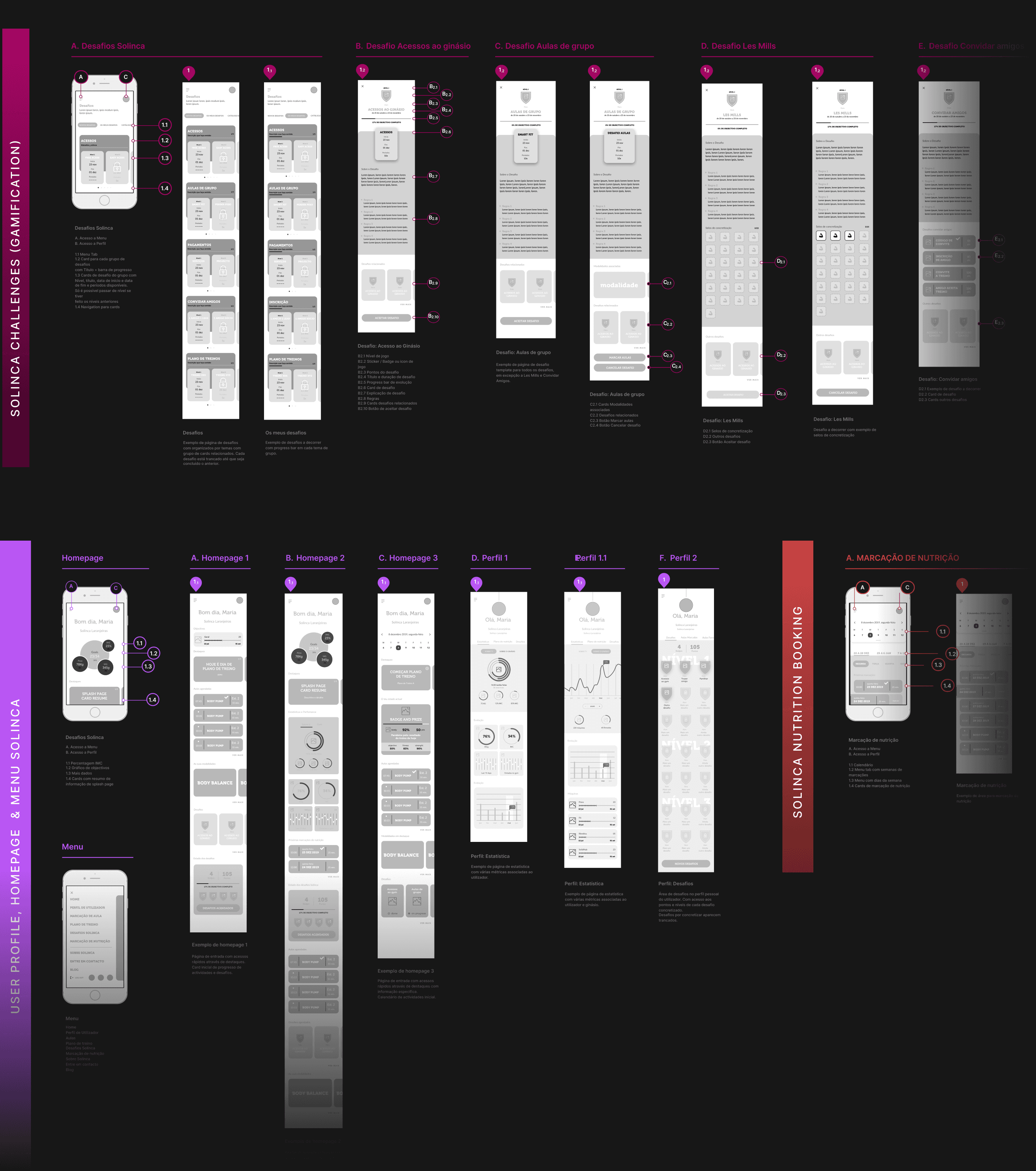
I translated the structural decisions into detailed user flows and low-fidelity wireframes, defining layout, navigation patterns, and core interactions. This step allowed rapid validation of the experience before moving into visual design.
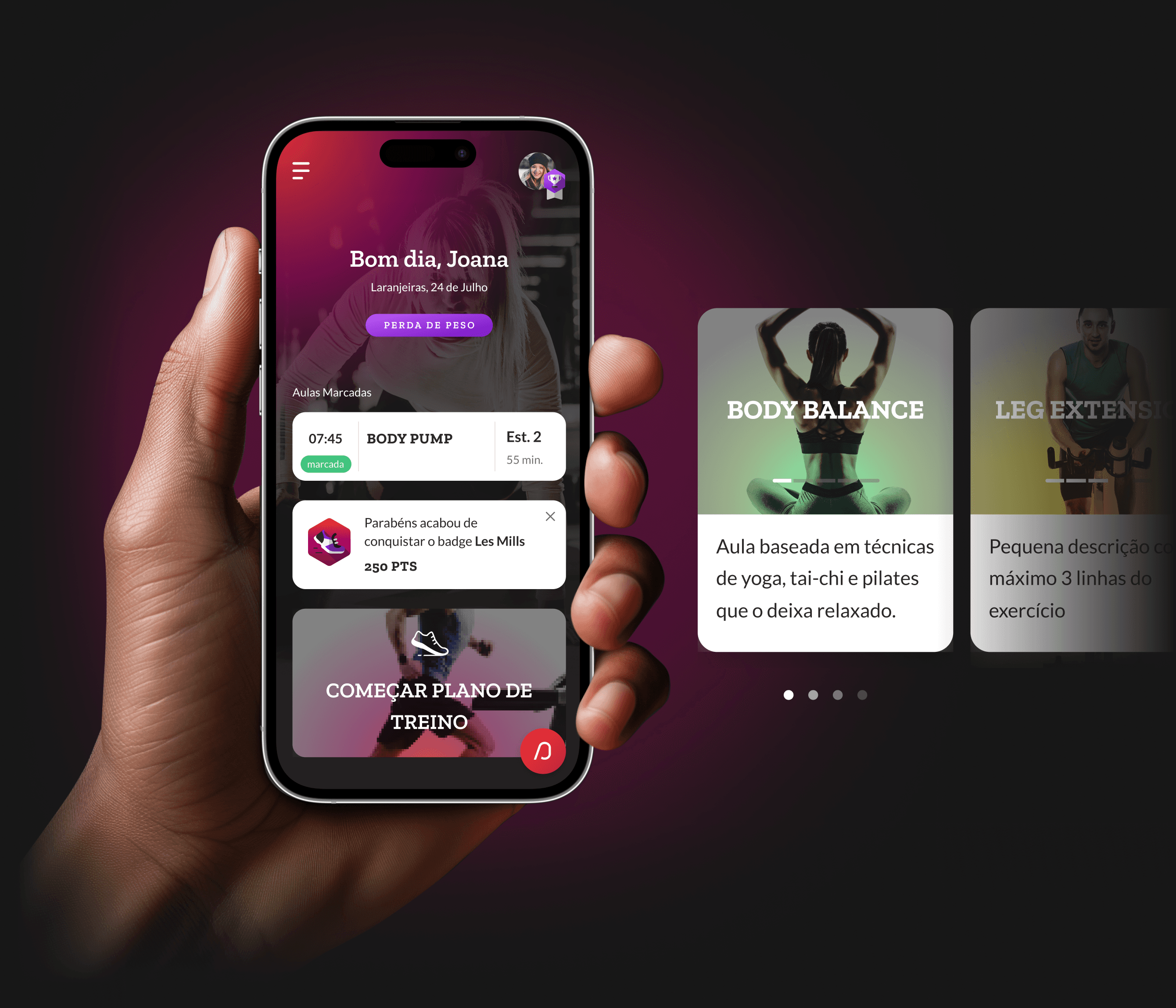
3 - DESIGN ↓
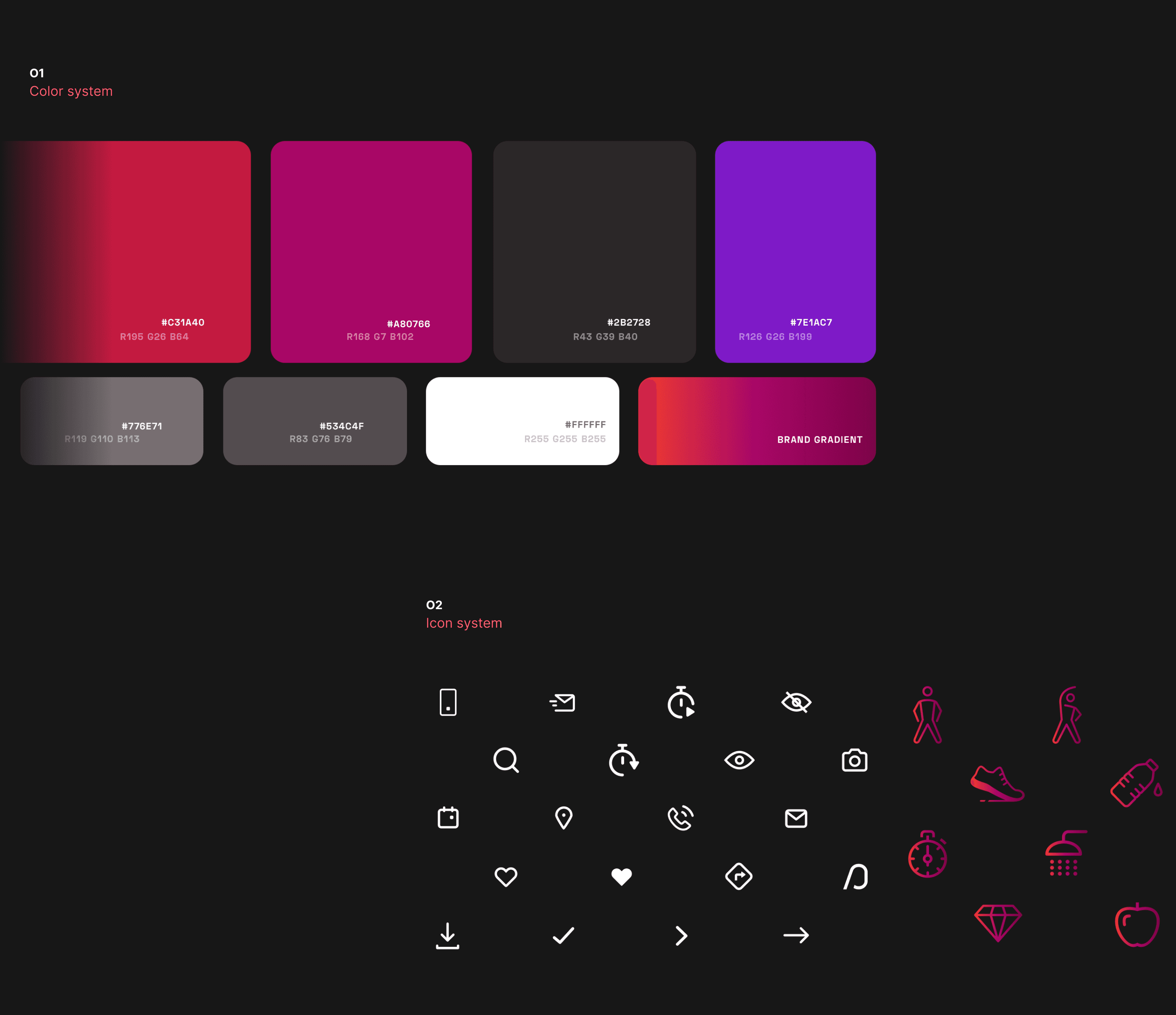
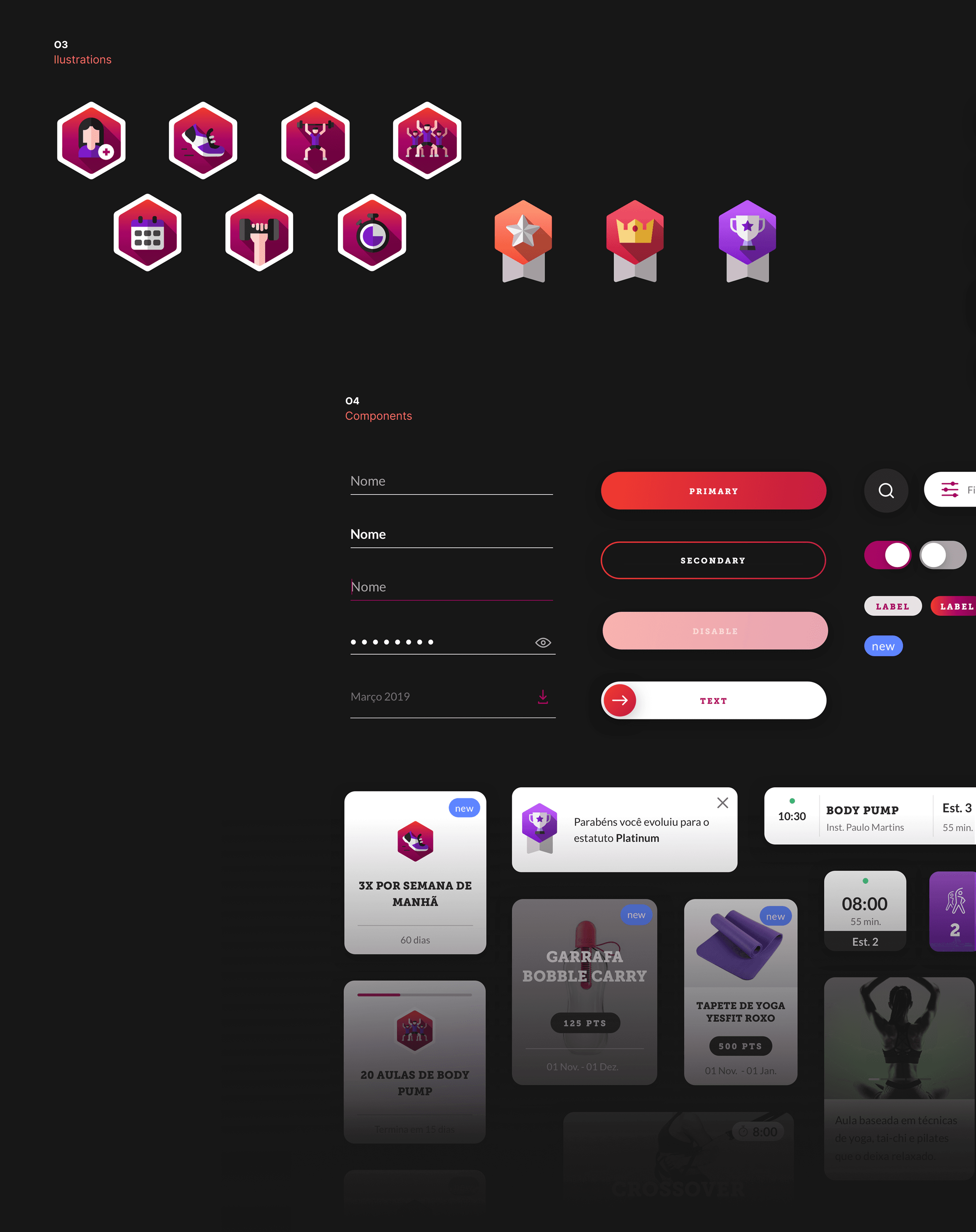
I developed the full interface design, refining hierarchy, layout, and interaction details to create a cohesive and intuitive experience. A modular UI library supported consistency across screens and streamlined handoff to the development team.
4 - KEY LEARNINGS
Clear alignment between research and design accelerates decision-making. Having strong insights upfront allowed me to focus on structure and usability, and it reinforced the value of building scalable systems—especially when handoff goes to an external development team.
FOUNDATIONS

WIREFRAMES
DESIGN


see also


