Hiring form
Revamping Proxify's hiring form to improve clarity, user experience, and conversion rates

Challenge
The previous hiring form forced users through multiple steps, making the process feel slow and complicated. It also lacked clarity on purpose and completion time, leading to hesitation and drop-offs. User interviews showed a major expectation gap: the CTA “Find developer” suggested users would immediately see developer profiles, but instead they were led to a call-booking flow — causing confusion and frustration. Data reinforced this friction: users navigated eight screens, made 21 clicks, and read 46 lines of copy just to submit a lead. Paid search converted below 2%, and only one in three leads booked a call, confirming a misaligned and overly demanding experience.
Solution
I redesigned the hiring form using insights from user research, data, and competitor analysis to reduce friction and improve intent.
Simplified the flow by reducing steps, clicks, and cognitive load
Clarified expectations with clearer copy and guidance
Tailored questions using adaptive form logic
Reinforced trust with social proof and microcopy
Added progress and motivation cues to encourage completion
The result was a faster, clearer, and more confidence-driven experience.
Results
We ran an A/B experiment comparing the redesigned hiring form against the original version for 8 weeks. The new version consistently outperformed the control across all key funnel metrics, which led us to fully roll it out — while continuing to iterate and optimise specific steps.
The new form led to:
Average time to complete the form dropped from ~4 min. to ~2 minute
Contact details capture rate increased to +28.6%
Conversion from lead → booked call improved by +15.8%
TL;DR
The hiring form is a key step in Proxify’s client journey where clients share their project needs and assess whether Proxify is the right partner. By simplifying the flow and clarifying expectations, we improved trust, reduced friction, and increased the quality of incoming leads.
the process
1 - DISCOVERY ↓
We interviewed potential clients, analysed the existing form for friction points, reviewed data, and benchmarked competitors.
2 - WIREFRAMING ↓
I translated the research insights into clearer flows and interactions, focusing on simplifying steps, clarifying value early, and guiding users through a smoother journey.
3 - DESIGN ↓
Wireframes became final UI with refined hierarchy, tone, and components to improve clarity, trust, and reduce cognitive load.
4 - KEY LEARNINGS ↓
UX is iterative: even with good results, user feedback showed expectations evolve — especially around wanting value before sharing contact details. This shaped the next round of improvements.
DISCOVERY
Finding the root causes behind drop-off
Conducted user interviews with potential clients to understand expectations and pain points in the current flow.
Mapped the existing hiring form step-by-step to identify friction points (where users slowed down, hesitated, or dropped off).
Analysed platform data to quantify drop-off severity and measure effort (screens, clicks, copy).
Benchmarked competitors to understand how other hiring platforms frame value, structure their funnels, and set expectations before capturing intention.
Collected input from key internal stakeholders (Sales, Client Managers, Growth) to validate insights against business needs, operational realities, and downstream sales workflows.
WIREFRAMES
Most impactful changes:
Reduced the overall flow into fewer, more meaningful steps to make the process feel faster and lighter.
Created a new layout structure focused on reducing cognitive load and improving readability
Introduced a clear value intro at the start of the form to set expectations and explain what happens next.
Added trust cues and expectation framing throughout the journey (social proof, progress indicators, reassurance microcopy).
Improved alignment between the “Find developer” CTA and the outcome by showing progress transparently rather than surprising users at the end with a call booking requirement.
DESIGN
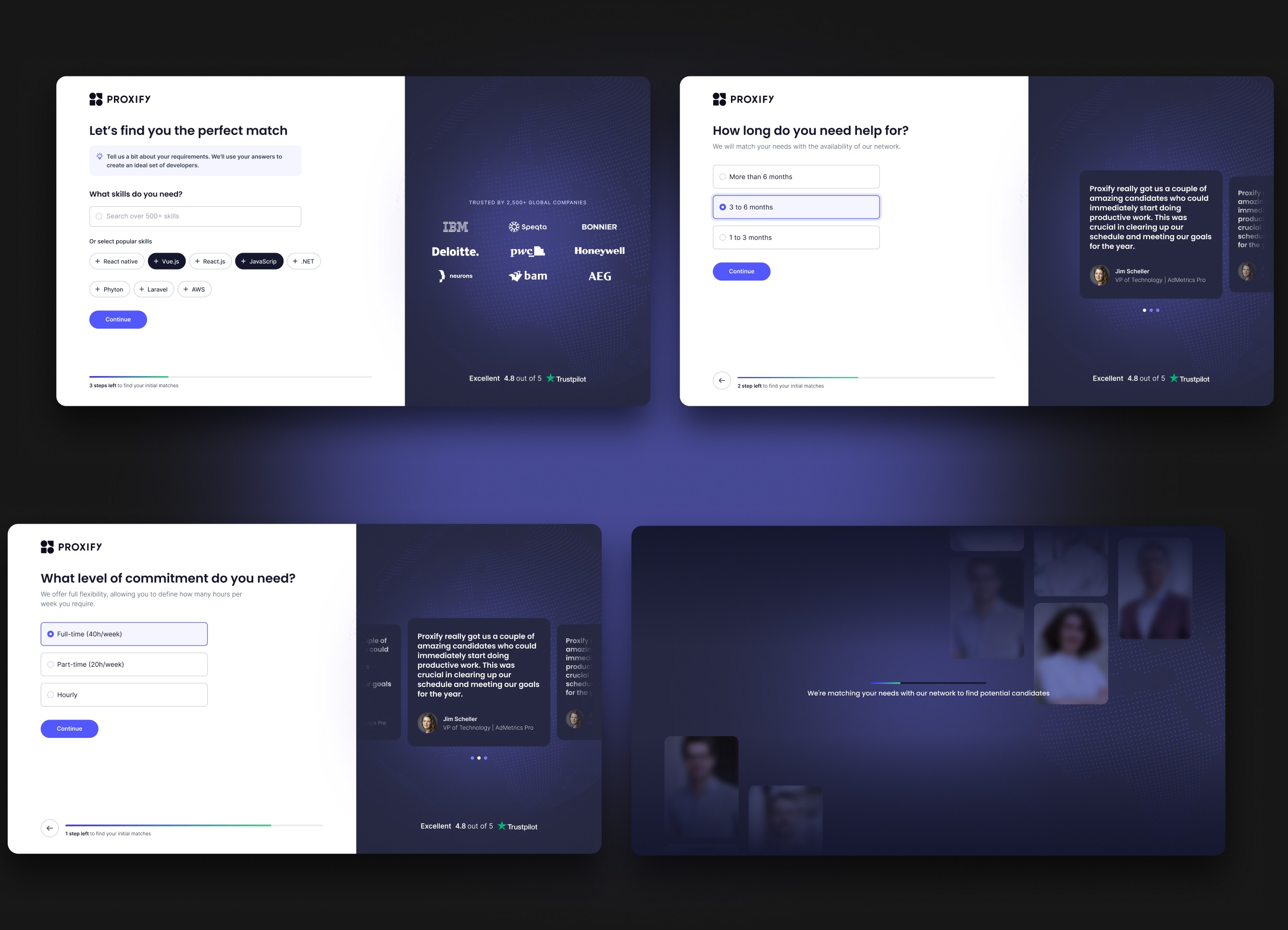


Key design considerations
Refined the visual hierarchy to prioritise key actions and evolved the visual style from playful to more professional — better aligned with Proxify’s brand values.
Introduced a progress indicator to set expectations and reduce uncertainty across steps
Improved microcopy tone of voice to be more supportive, conversational, and purpose-driven
Added the social proof area with trust cues
Added developer animations using labor-illusion principles to reinforce progress and keep users engaged.
KEY LEARNINGS
A key takeaway from this project is that improvement is never static — even when metrics go up. UX requires ongoing validation. Early research revealed a core expectation gap: users clicked “Find developer” but weren’t shown any developers throughout the flow. We addressed this by pre-showing developer context to create a sense of value in the “book a call” step.
However, follow-up interviews showed that some users still didn’t feel sufficiently rewarded before committing their contact information. This made it clear that even positive performance uplift doesn’t mean the experience is “resolved.”
Continuous iteration, not assumptions — is what closes the expectation gap.


see also


