New CMS
Empowering Proxify’s website management — rebuilding the CMS for flexibility, speed, and scale

Challenge
Proxify’s previous CMS setup was not scalable — almost every change required design + development involvement. As a result, content production was slow, costly, and dependent on engineering. The old CMS was overwhelming for non-technical users and lacked reusable components, which meant that even simple marketing copy updates required a release. With the company scaling, our goal was to unlock flexibility and move from 6 website changes per quarter to 600 — while ensuring consistency in brand, UX, and layout foundations.
Solution
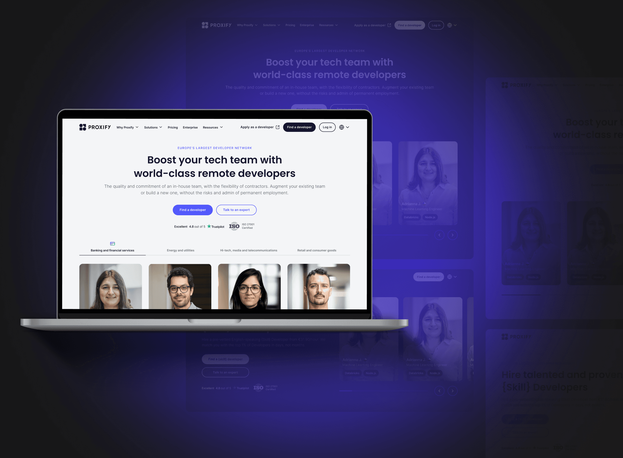
We migrated to Storyblok and used this moment not only to rebuild our CMS infrastructure — but to democratise it.
I mapped every existing component across the website and, together with the PM and stakeholders, decided which components to keep, redesign, or remove. Outdated modules/sections were refreshed to better reflect brand, hierarchy, and tone of voice. From there, I built a modular component system with variations to give marketing flexibility without losing consistency, and wrote implementation specs to ensure smooth development handoff.
The core UX principle: content teams should be able to self-serve — without compromising brand quality.
Outcome
We shifted from a custom, page-by-page setup to a modular system built from reusable components. This transformation enabled faster content creation without developer dependency, greater flexibility for the Marketing team, and consistent design across all pages — creating a single source of truth for components and documentation.
We didn’t just change the CMS — we changed how Proxify builds its website.
TL; DR
Proxify needed a more flexible CMS to publish faster and scale content without relying on designers or developers. By restructuring components, improving content workflows, and aligning design with brand and technical constraints, we enabled the marketing team to ship pages independently and accelerate iteration.
the process
1 - DISCOVERY ↓
I mapped existing website components and analysed behaviour with Clarity heatmaps to identify what users engaged with, ignored, or struggled with.
2 - DEFINE ↓
Working with the PM and stakeholders, we prioritised which components to keep, redesign, or remove — establishing a modular, scalable system for the Marketing team.
3 - DESIGN ↓
I translated the strategy into a cohesive, flexible visual system that stayed consistent, accessible, and aligned with Proxify’s brand across devices and use cases.
4 - KEY LEARNINGS ↓
Close collaboration across teams ensured components met technical and content needs. Balancing speed and quality helped us focus on the highest-impact components.
DISCOVERY

Key research activities included:
Component audit: Mapped every existing module across the website to identify inconsistencies and design debt.
Behavioural analysis (Clarity heatmaps): Observed clicks, scrolls, and drop-off areas to distinguish high-intent from low-engagement blocks.
Content usage patterns: Assessed how Marketing teams currently used components versus the flexibility they needed.
Brand alignment check: Highlighted outdated layouts, typography, or visuals that no longer reflected Proxify’s updated identity.
Technical feasibility discussions: Collaborated early with PM and Engineering to define what could be reused, rebuilt, or redesigned for scale.
DEFINE

After synthesising the research insights, I collaborated with the PM and stakeholders to set clear priorities for the new CMS.
Key actions:
Identified which components to keep, redesign, or remove, balancing user needs, brand alignment, and technical feasibility.
Defined the structure for a modular, scalable component system to support faster content creation.
Ensured the Marketing team could self-serve and build pages independently without sacrificing usability or consistency.
DESIGN


Key design activities:
Redesigned and standardised components to create a consistent, modular system that supported rapid content creation.
Explored design variations for different layouts, alignments, to give Marketing more flexibility.
Defined responsive breakpoints to guarantee that all components worked flawlessly across devices.
Created light and dark mode versions to maintain accessibility and brand coherence across themes.
Documented design specs and states for development handoff, ensuring pixel-perfect implementation in Storyblok.
Validated usability and readability, focusing on clarity, hierarchy, and reducing cognitive load across all modules.
This phase turned the CMS rebuild into a flexible, design-driven system — empowering non-designers to create pages that feel cohesive, on-brand, and user-friendly.
KEY LEARNINGS
This project reinforced the value of cross-team collaboration. Working with Developers and QA ensured scalable, high-quality implementation, while feedback from Content and Marketing confirmed that components met real needs and supported independent page creation.
We also learned to balance speed with long-term quality. While the focus was on new pages, we deprioritised the homepage. The new CMS initiative was the perfect time to update outdated components and improve brand alignment and user experience.
see also


